Finding your way around a business complex can be confusing. It’s unrealistic to expect employees to be available or break from their daily work routine to provide clear directions. So how do you provide adequate service to potential and current customers to help them find their desired locations? The obvious solution is to install effective wayfinding signage.
Wayfinding signs provide clear and concise directions, helping visitors easily navigate complex areas. Beyond functionality, effective wall wayfinding signage transforms an office into a more cohesive and harmonious environment, boosts safety and accessibility, and adds to the professional polish of the business environment.
Essential Safety and Regulatory Signage
Effective wayfinding signage is crucial for guiding visitors and ensuring their safety and compliance with various regulations. This type of signage provides clear, unambiguous instructions and information, reducing the likelihood of unsafe or unlawful activities and playing a critical role in safeguarding the office environment.
Bathroom Signage
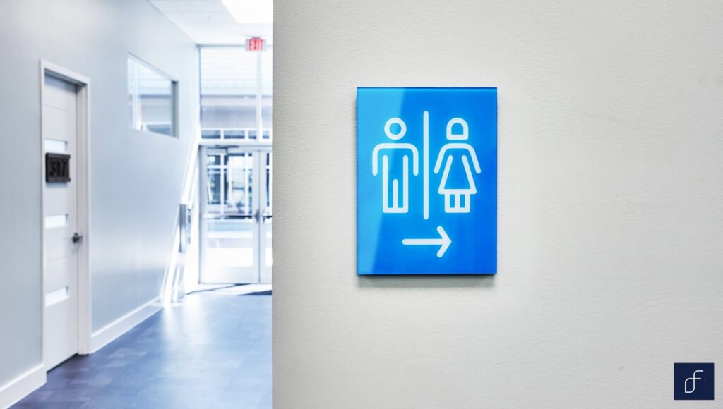
Bathroom signage is essential for wayfinding and regulatory compliance, especially in large or busy environments such as shopping malls, office buildings, and airports. These signs help people locate restrooms easily without needing to ask for directions. By including Braille and tactile elements, bathroom signage complies with ADA (Americans with Disabilities Act) standards, ensuring accessibility for visually impaired individuals. Modern designs often feature inclusive symbols to cater to all genders, reflecting a business culture that is forward-thinking and committed to diversity, equity, and inclusion.
Effective bathroom signage entails markers that use bold colors and clear, simple symbols, along with Braille text and raised pictograms. This not only complies with ADA standards and promotes better accessibility but also adds a polished and professional look to the commercial environment, contributing to a cohesive, welcoming, and visitor-friendly atmosphere.
Fire Escape Route Maps
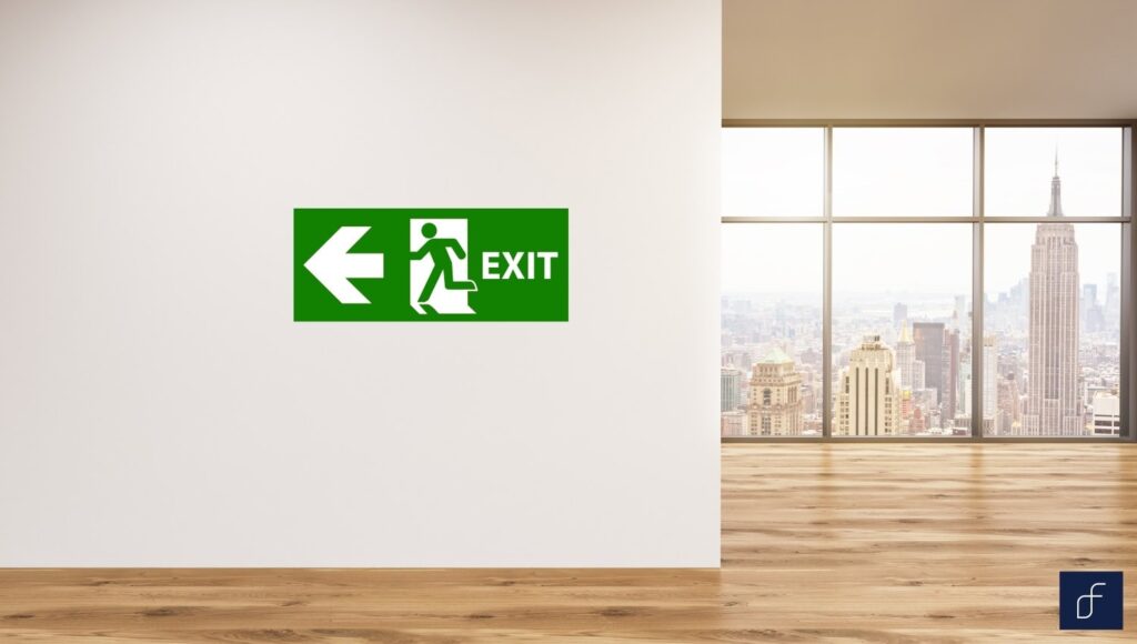
Fire escape route maps are a critical component of any building’s safety plan, providing occupants with clear instructions on evacuating in an emergency. These maps enhance emergency preparedness by ensuring everyone knows the quickest and safest exit routes, which is crucial for preventing panic and ensuring orderly evacuations. State and local fire safety regulations mandate the presence of these maps to comply with building code standards and protect building occupants.
While traditional fire escape route maps often blend into the background, there is an opportunity to present this essential element as a stylish and sustainable feature.
Incorporating Fracture’s biodegradable glass prints for fire escape route maps can add an element of gravity and sustainability to your office space. Not only do these prints comply with safety regulations, but they also improve aesthetic appeal and stand out more readily to observers in the event of an emergency. Using premium, eco-friendly materials, these maps provide clear guidance while aligning with your company’s commitment to environmental preservation. This combination of functionality and beauty helps create a more organized business operation and demonstrates to your employees and visitors that safety and smart planning are of the utmost priority in your company culture.
Warning Signs
Warning signs are crucial for communicating deviations from your standard office environment that may pose potential hazards to nearby or approaching persons. These temporary signs play a key role in maintaining safe surroundings for employees, visitors, and customers by alerting them to dangers such as wet floors, electrical hazards, and construction zones, thereby helping to prevent accidents and injuries.
While warning signs are extremely important, there is nowhere in the standard operating plan that says they need to be old-fashioned, generic, and boring. A well-designed warning sign can be a decorative piece and a vocal promoter of your brand ethos while still serving its primary purpose. Using bold colors, strategic placements, and a dash of wit and creativity, these signs can effectively communicate essential information while expressing the tone and voice of your brand and enhancing the overall aesthetics of your environment. You can print these signs in various materials, such as high-quality glass prints, acrylic, or even metal, to suit your space’s style. Consider incorporating eye-catching graphics, pithy or humorous wordplay, modern fonts, and unique shapes to create signs that are both informative and visually appealing.
By investing in thoughtfully designed warning signage, you can elevate your workspace’s appearance and lighten the mood while still ensuring the well-being of your employees and visitors.
Directional and Informative Signage
Directional signage guides people to specific destinations and helps them navigate unfamiliar environments. Informative signage provides general information about an area, such as hours of operation, available facilities, or important notices. These signs help individuals easily navigate the space, reducing confusion and enhancing safety and efficiency, ultimately improving the visitor experience.
Entrance Signs
An entrance sign is more than just a piece of signage; it’s the inaugural handshake, the welcoming committee, and the silent ambassador of your brand. It’s the first visual encounter, setting the tone for the entire experience.
From the towering, bold statements that grace corporate headquarters to the quaint, inviting signs of a cozy boutique, entrance signs are the storytellers of your brand. They communicate identity, values, and a sense of place. These beacons draw people in, creating anticipation for what awaits. They can include vital details such as business hours, contact information, and welcome messages, ensuring visitors have all the necessary information upon arrival to maximize their experience.
Beyond its practical purpose of guiding visitors, an entrance sign is a powerful branding tool. It reinforces the foundational principles and customer engagement tone of your company, creating a positive impression even before any transaction takes place. A visually striking and well-maintained sign can elevate your business’s perceived value and prestige. It’s a golden opportunity to showcase your creativity and originality, setting you apart from competitors. In essence, an entrance sign is the first chapter in your brand’s story, and it should be crafted with care and intention.
Directory Signs
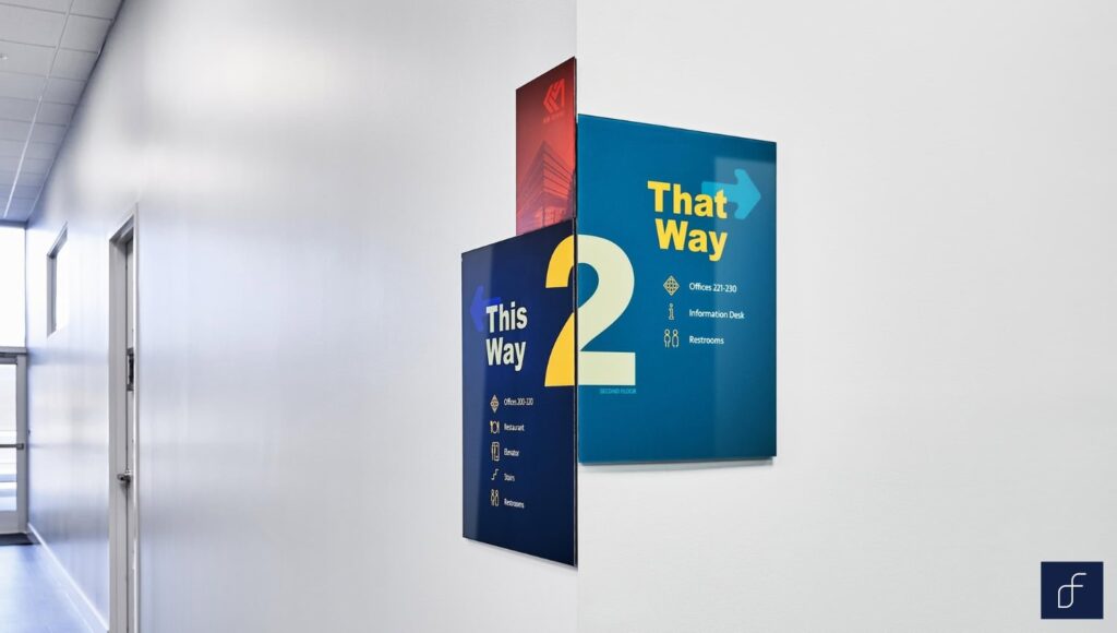
Often overlooked, facility directory signs are the silent guides, patiently waiting to assist lost souls. These unassuming information hubs are the connective tissue of a building, linking people to their desired destinations. They provide a comprehensive overview of a building’s layout and tenants, listing all key areas and their reference numbers to guide visitors effectively.
A directory sign can be much more than just a practical and straightforward element occupying the front of your commercial space. Consider elevating your directory design with innovative materials. Instead of traditional printed directories, opt for handsome glass panels with printed directory information. Fracture glass prints offer a modern, sleek, and visually striking option. You can easily customize these new-age prints to capture your company logo, brand colors, and even a captivating image that aligns with your business and property aesthetic. The result is a directory that provides essential information but l also serves as an attractive introductory marketing presentation for your company and its offerings..
Room Identifiers
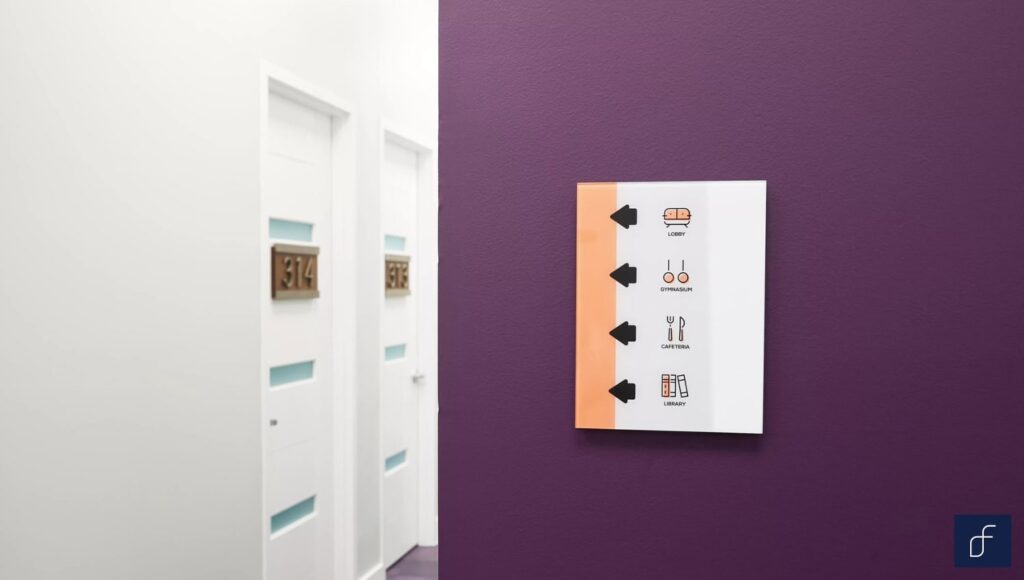
These simple signs are the pats on the back reassuring visitors they’ve arrived in the right place. Clear and stylistically consistent room labels are essential for a seamless visitor experience within any building. Bold fonts, high-contrast colors, and clear typography allow for quick identification. Uniform design elements for this signage type throughout the building help create an efficient navigational experience, fulfilling the final step of an office’s wayfinding system.
To maximize effectiveness, room identifiers should be designed with legibility in mind, employing large, easy-to-read fonts and high-contrast colors for maximum visibility. Positioning the signs at eye level and adjacent to room entrances ensures they are easily spotted and deciphered. Integrating technological advancements, such as digital nameplates, allows for quick and easy updates and is particularly useful in spaces with frequently changing occupants, such as conference rooms.
Office Designator Plaques
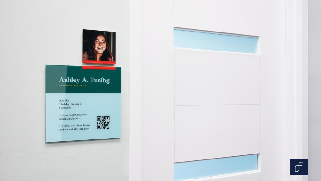
Office designator plaques provide basic information about the occupants of individual offices, such as names, titles, and departments. These plaques inform passersby about the identity of the person or persons likely to be inside the room, ensuring that visitors can easily confirm they are at the correct location. Additionally, they convey a sense of order, professionalism, and organization within the office environment.
Design considerations for office designator plaques include maintaining a uniform design across all plaques, affixing plaques in the same location relative to each office door, and utilizing different colors to indicate different departments or employee roles. Using high-quality materials ensures durability and longevity, allowing the plaques to withstand wear and tear over time.
Specialized Signage Solutions
Specialized signage solutions cater to specific needs within business environments. Such signs can enforce compliance with regulations, address evolving health guidelines or offer versatile options to allow for use in various settings.
Compliant Braille Signs
Compliant Braille signs are necessary for businesses to ensure accessibility for visually impaired individuals, allowing them to navigate commercial spaces independently. These signs include tactile text and the trademark raised bumps of the Braille alphabet, providing essential information that can be felt and read through touch. The ADA mandates that certain signs in public buildings, such as room identifiers and directional signs, must include Braille and tactile text.
The importance of compliant Braille signs extends beyond legal compliance. They promote societal inclusivity by ensuring that all individuals, regardless of ability, are welcome to access and navigate the commercial space without hindrance. Meeting these legal requirements helps the enterprise avoid potential fines and enhances the organization’s reputation as an equitable and accessible environment. By adhering to these standards, businesses emphasize an open-minded, welcoming, and considerate approach to conducting business that is sure to be appreciated by both able-bodied and disabled visitors alike.
Conference Room Signage
Conference room signage is the office bugle that sounds the familiar trumpet notes loud and clear, calling employees and visitors to gather around the campfire. These signs ought to stand out more than the office’s standard room identifiers, as they guide and herd a heavier amount of foot traffic through their doors. Gone are the days of bland, generic, static signage. Today’s conference room signage is an exciting blend of form and function, seamlessly integrating the latest technology to enhance workplace communication and connect colleagues like never before.
Clear, concise, and visually appealing signage both outside and within a conference room is important. Large, legible fonts and high-contrast colors facilitate rapid digestion and comprehension of information. Digital displays offer real-time updates on room availability, eliminating the frustration of double-booked meetings or sudden in-meeting interruptions.
But conference room signage goes beyond mere practicality. It’s an opportunity to elevate your office aesthetic while boosting morale in one of the office’s premier places of congregation. By incorporating your company’s branding, using high-quality materials, and exploring innovative design elements, you can create a series of conference room signs that are captivating and purposeful focal points. A well-designed conference room sign not only provides essential information but also actively contributes to a positive and productive office culture.
Safety and Protocol Signage
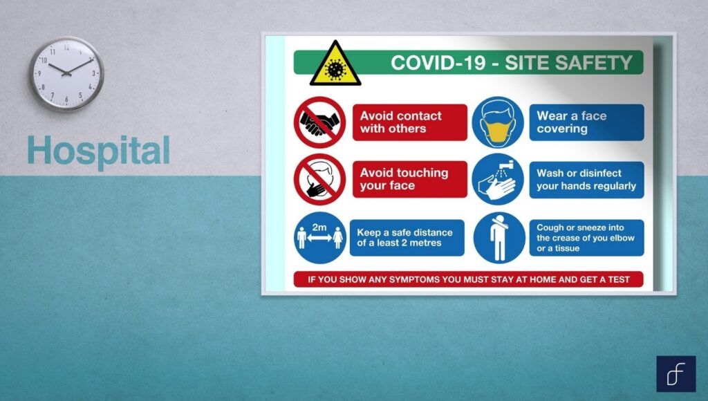
The COVID-19 pandemic reinforced the need for businesses to keep on hand flexible and adaptive signage that informs visitors of health protocols and promotes maintaining a safe and sanitary environment. As safety protocols evolve, signage must be regularly updated to reflect current mandates such as mask requirements, social distancing measures, and hygiene practices.
Temporary, modular, or digitally adaptable signage solutions are necessary for businesses to remain prepared and ready to adapt to sudden changes in federal and/or local mandates.
A-frame Signs

A-frame signs, also known as sandwich boards, are versatile signage solutions suitable for various business settings. These signs are commonly used for outdoor advertising outside retail stores, restaurants, and cafes to attract foot traffic via promotions, menus, and special offers. They are also ideal for event hosting, helping to direct attendees, provide information, and display schedules. Additionally, A-frame signs can be repurposed to convey temporary instructions such as construction warnings, parking directions, or special event notices.
Conclusion
Wayfinding signage is more than just practical information sharing; it’s a strong and silent sentry and sage storyteller guiding visitors on their magical odyssey through your commercial property From the moment someone steps through your doors, your directional signage sets the tone – inviting, informative, inspiring and indicative of your brand and core values.
Fracture offers more than just signs; we offer enterprise solutions. Our commitment to quality, sustainability, and innovation ensures that your workspace signage not only functions flawlessly but also elevates your space. Let’s collaborate to create signage that’s as unique as your business.
Ready to transform your space? Contact us today to embark on a signage journey that will leave a lasting impression.
FAQs on Wayfinding Signage
What is wayfinding signage?
Wayfinding signage is a system that combines graphic design, architectural design and landscape design to create signs, symbols and markers that guide people through a physical environment, helping them navigate with efficiency to reach their desired destinations.
What are the different types of signage in wayfinding?
There are four different types of signage in wayfinding: identification, directional, informational and regulatory. Each type plays a specific role within the greater wayfinding system to inform and guide individuals through a physical environment.
What is an example of directional signage?
An example of directional signage is an arrow sign in a shopping mall pointing towards the food court, restrooms and emergency exits. This type of sign helps shoppers quickly locate key areas within the mall.
How does wayfinding signage enhance customer experience?
Wayfinding signage enhances customer experience by improving navigation, reducing confusion and frustration, and promoting safety with clearly marked exits and instructions.
What are best practices in designing effective wayfinding signage for businesses?
Best practices in designing effective wayfinding signage include:
- Using clear, easy-to-read text and universally recognized symbols
- Maintaining consistent design elements
- Ensuring high visibility with well-lit placards and marquees
- Eye-level placement, using durable materials
- Including Braille and tactile elements for accessibility
- Regularly updating information to keep it current and accurate
What are the signs outside of businesses called?
The signs outside of businesses are commonly referred to as exterior signs or outdoor signs. These include building signs, entrance signs, monument signs, pylon signs, and A-frame signs. Each of these sign types is designed to weather the elements, attract attention, and provide essential information to passersby.
How to make a wayfinding sign?
To make a wayfinding sign:
- Identify Purpose: Determine if the sign is directional, informational, identification or regulatory.
- Design Layout: Create a clear, simple design with legible text and appropriate symbols.
- Choose Materials: Select durable materials suited for the environment where the sign will be placed.
- Incorporate Branding: Align the design with your business’s branding elements, including messaging tone as well as custom fonts and colorways.
- Include Accessibility Features: Add Braille and tactile elements to comply with accessibility standards if necessary.
- Install Properly: Position the sign in a highly visible and strategic location, ensuring it is securely mounted and does not pose a danger to passersby.
What are the colors for wayfinding signage?
The colors for wayfinding signage within a business should be chosen based on visibility, contrast, regulatory standards, and traditional meanings based on local customs. In the United States:
- Red is commonly used for prohibitive and fire safety signs
- Green indicates safe conditions like exitsBlue denotes informational signs and mandatory instructions
- Yellow warns of potential hazards
- Black and white are used for regulatory and directional signs.



Comments