
Office Wall Colors Quietly Shape Your Day
Ever walked into a room and instantly felt calmer, sharper, or more inspired, without even noticing why? That’s color psychology at work. Your office wall color has a subtle but powerful influence on how you feel, focus, and perform throughout the day. It’s not just about style, it’s about setting the tone for everything you do.
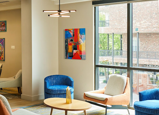
Whether you’re designing a cozy home office or a modern team space, choosing the right hues can help you stay centered, energized, or creative. In this guide, we’ll walk you through the best color options based on psychology and show you how to complement them with clean, intentional modern office wall decor like Fracture’s sleek glass prints.
Understanding How Colors Affect You at Work
Colors are more than just design choices, they’re part of the way we think and feel. When used thoughtfully, wall colors can increase your energy, calm your nerves, or help you stay focused longer. Here’s how the most popular colors for office walls influence mood, mindset, and productivity.
Blue Helps You Focus and Stay Calm
Blue is known for its ability to create a calming, stable environment. It’s ideal for tasks that require focus, logic, or long hours at a desk, such as coding, editing, or finance work. Soft, light blues are especially good at reducing stress and keeping your thoughts clear. Deeper blues, like navy, bring a sense of professionalism and help with strategic thinking.
Green Supports Balance and Well-Being
Green connects us to nature, making it ideal for reducing visual fatigue. It creates a sense of balance and comfort, which is especially useful in spaces where people work for long stretches. Shades like sage or olive add warmth without overpowering the room. If you’re working from home, green can help your space feel grounded and relaxed.
Yellow Sparks Creativity and Optimism
Yellow is a color of energy and fresh ideas. It encourages optimism and promotes mental clarity, which makes it perfect for idea rooms, brainstorming corners, or creative studios. But it works best in small amounts: use it on one wall, in artwork, or through accents to avoid overstimulation.
Gray Adds Sophistication and Flexibility
Gray is neutral and works well with both bold and soft colors. It allows your furniture, lighting, and wall decor to take center stage. In office environments, gray creates a timeless, professional feel and reduces distractions. Warmer grays are more inviting, while cooler shades feel sleek and modern.
White Keeps Things Minimal and Open
White is perfect for small or shared spaces. It opens up the room, creates a clean canvas, and reflects light beautifully. It’s often used in minimalist office setups. To keep white walls from feeling sterile, pair them with warm-toned furniture or natural textures like wood, linen, or glass prints.
Red Brings Energy, But Use It Cautiously
Red boosts alertness and can create a sense of urgency, which makes it useful in dynamic, fast-paced environments like sales areas. It increases heart rate and draws attention, but it can also increase stress if overused. Consider using red in accessories or accent walls rather than large surfaces.
How to Choose Colors Based on Your Workspace Type
Instead of picking a color just because it looks good, think about how your workspace functions. Each room has a purpose and the right color can help support it.
- Home Office: Choose soft green, beige, or muted neutrals to create a peaceful setting. These tones help you stay mentally focused and comfortable during long hours of solo work.
- Creative Studio: Use yellow, orange, or coral to energize your space and encourage innovative thinking. These colors stimulate your brain and add visual warmth.
- Team Spaces: Light blue and soft green promote clear communication and harmony. These tones are calming and help reduce tension during collaborative work.
- Client Meeting Rooms: Stick with professional colors like gray, charcoal, or off-white. These shades show clarity, stability, and create a confident first impression.
- Sales Areas or Task Zones: Red or bold accents keep energy levels up and support action-driven work. Use sparingly to avoid visual overwhelm while maintaining a sense of urgency.
Can Wall Decor Boost Your Productivity Too?
Yes. Color is the base, but what you put on the wall matters just as much. Well-chosen decor adds emotional cues, focus, and inspiration.
A calm photograph, a quote that reflects your values, or a moment captured in time can make your space feel more personal and more motivating. That’s where Fracture’s modern office wall decor options come in.
Fracture’s Glass Prints Enhance Any Office Color Scheme
Our glass prints are designed to blend seamlessly with the tones of your space while adding personality.
- No frames needed: Prints go directly on glass, giving a modern, minimalist look.
- Matte finish: Perfect for office lighting with no glare or reflection.
- Custom sizes: Choose from unique dimensions that work with any room layout: from 10.8″ x 14.4″ to 21.6″ x 28.8″.
- Design compatibility: Looks great on white, gray, or colorful walls.
Take a peek behind the scenes to see how a glass print is made.
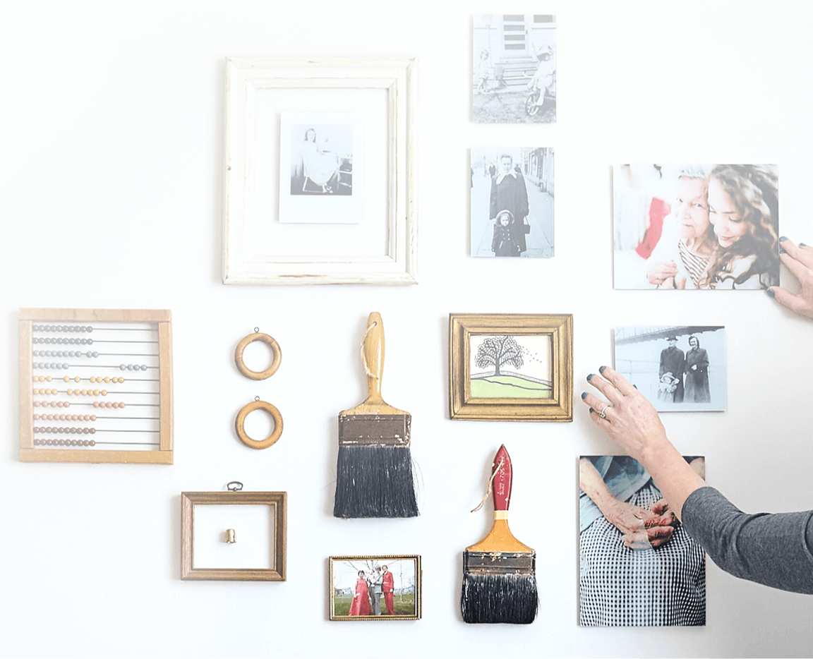
Build a Gallery Wall That Matches Your Mood and Space
Fracture’s Gallery Walls are thoughtfully designed bundles that simplify your decorating process while helping your space feel cohesive and elevated. Instead of piecing things together one by one, you get a ready-made layout that’s already been planned for balance and beauty.
- Balanced layout: Every set is pre-arranged by design experts to ensure visual balance. You don’t have to worry about alignment or symmetry, it’s already been handled for you.
- Bundle discount: Buying a set offers better value than purchasing prints individually. It’s ideal if you’re designing an entire room, planning a feature wall, or simply want a stress-free decorating experience.
Design That Works With You, Not Against You
Picking the right office wall color isn’t about trends, it’s about what helps you focus, feel good, and do your best work. Combine calming or energizing tones with intentional, beautiful wall decor like Fracture’s glass prints to create a workspace that reflects your goals.
Start with color. Add story. Make it yours.
Check out Fracture’s prints for modern office spaces
Key Takeaways
- The color of your office walls directly impacts your mood, energy, and productivity.
- Blue, green, and beige promote calm and focus, while yellow and red boost creativity and urgency.
- Choose wall colors based on how the space is used, no one-size-fits-all approach.
- Minimalist wall decor like Fracture glass prints adds personality without clutter.
- Gallery Wall bundles simplify decorating and create cohesive, balanced displays.
- Combining color psychology with intentional design makes your workspace truly functional.
Frequently Asked Questions
Question : What is the best color to boost productivity in the office?
Answer : Blue is considered the most effective color for productivity. It supports deep focus, helps reduce mental fatigue, and creates a calm environment for analytical tasks like writing, coding, or planning.
Question : Which colors make an office feel calming?
Answer : Green and soft beige are top choices for calming spaces. They promote a sense of balance and stability, lower stress levels, and help create a soothing atmosphere for long work sessions or home offices.
Question : How do I make a neutral office feel less boring?
Answer : To prevent a neutral office from feeling dull, add contrast and depth using textures, layered lighting, or bold accent pieces. A modern glass print or framed artwork can bring the space to life without breaking the calm.
Question : Does office art really affect productivity?
Answer : Yes, studies show that art in the workplace can reduce stress and increase employee engagement. Meaningful visuals like calming images, motivational quotes, or personal photos can make your space more enjoyable and productive.
Question : Can I use multiple colors in one office space?
Answer : Yes, combining colors can be highly effective when done with intention. Use a dominant color for the main mood like a calming blue and add one or two accent colors to introduce contrast or energy. For example, a blue and white base with yellow or coral accents can support both focus and creativity. Just make sure the palette feels balanced and not visually overwhelming.
Question : Are Fracture prints available in regular frame sizes?
Answer : Fracture prints don’t use traditional frame sizes. They’re printed directly on glass in 4:3 dimensions like 10.8″ x 14.4″ or 21.6″ x 28.8″, offering a modern, frameless aesthetic that suits both minimalist and dynamic office styles.


Comments