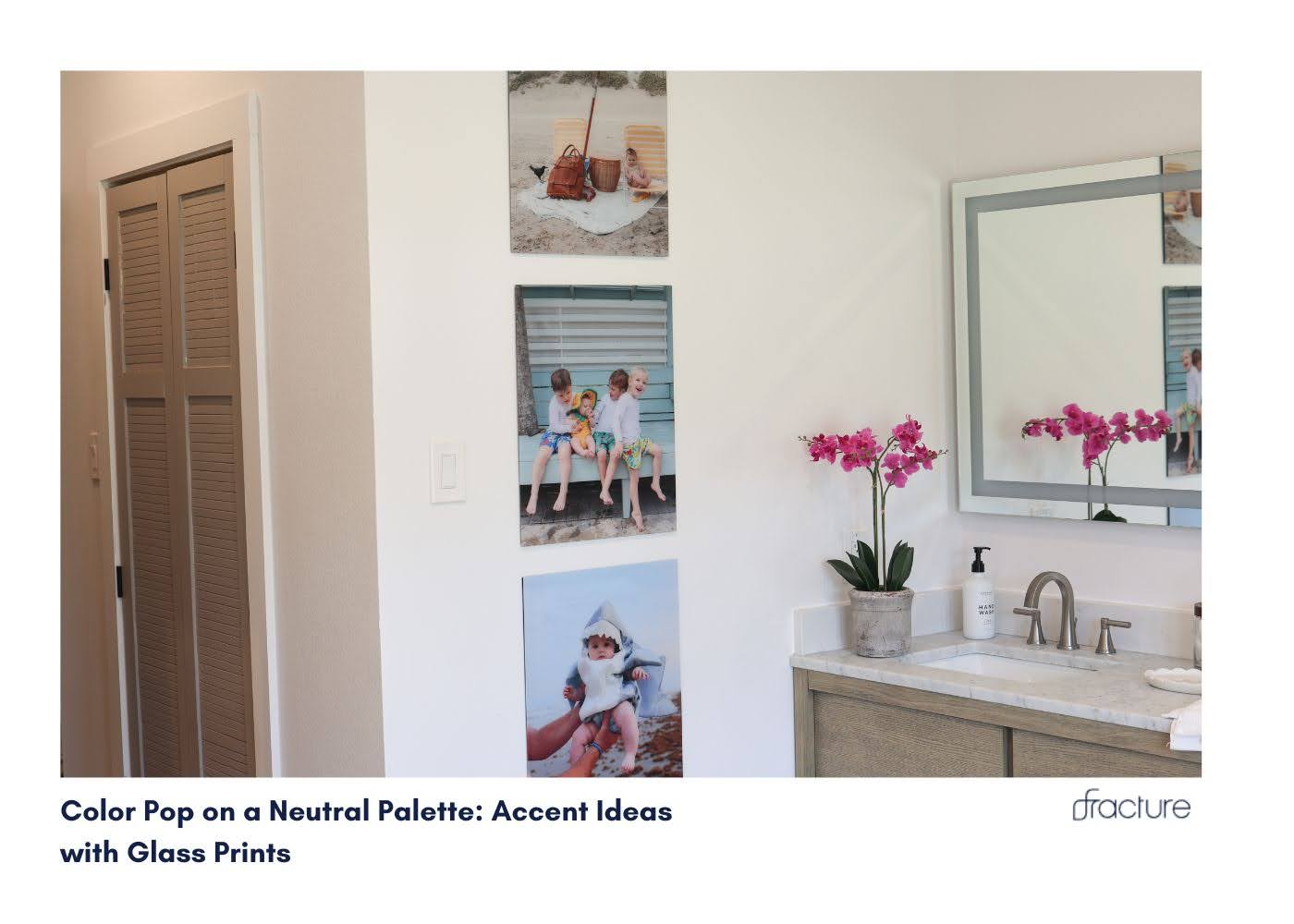

Your neutral bathroom is beige-ing you to death.
Let’s inject some personality into that sea of whites, grays, and taupes without losing the serene sanctuary you’ve worked so hard to create. Modern bathroom wall decor doesn’t have to choose between calm and colorful, the secret lies in strategic color pop wall art that energizes your space while maintaining sophisticated balance.
The game-changer? Glass prints that turn your favorite vibrant memories into stunning bathroom accent wall décor.
TL;DR
Transform your neutral bathroom with strategic pops of color using glass prints. Learn how to choose the perfect accent colors, create visual interest without overwhelming your space, and use modern bathroom wall décor to achieve that coveted designer look that’s both calming and energizing.
Why Color Pop Wall Art Changes Everything in Neutral Bathrooms
Your neutral bathroom isn’t boring, it’s a blank canvas waiting for the right splash of personality. The beauty of neutral palettes lies in their versatility, but without intentional color accents, even the most expensive neutral bathroom can feel sterile and forgettable.
Modern bathroom wall décor trends for 2025 emphasize the “quiet luxury” approach: sophisticated neutral foundations enhanced by carefully chosen colorful accents. This strategy means your bathroom accent wall décor should deliver maximum visual impact while maintaining the peaceful atmosphere that makes neutral palettes so appealing.
The wall space in your bathroom is prime real estate for color experimentation, it’s where you can be bold without committing to expensive tile or fixture changes.
Bathroom Accent Wall Décor Gets Strategic
Glass photo prints offer unmatched color vibrancy that brings life to neutral spaces without the commitment of permanent color changes.
Here’s why glass prints excel at creating color pop wall art:
Saturated Color Reproduction: The direct printing process on glass enhances color saturation and clarity, making that sunset photo or vibrant flower shot pop dramatically against neutral walls.
Flexible Color Commitment: Unlike painted accent walls or colorful tile, glass prints let you experiment with bold colors risk-free. Love coral this season, but think you’ll prefer emerald next year? Simply swap your prints.
Layered Visual Interest: Glass prints create depth through their reflective surface, adding dimension to flat neutral walls, while the colors create focal points that draw the eye.
What Colors Make a Small Bathroom Look Bigger?
Cool-toned color pops work magic in small neutral bathrooms. Blues, soft greens, and lavenders create the illusion of depth and space while adding personality. These colors recede visually, making walls appear farther away.
Light, bright accent colors reflect light around the room, enhancing the spacious feeling that neutral palettes naturally create. Think soft corals, pale yellows, or mint greens rather than deep, saturated jewel tones that can make small spaces feel cramped.
Strategic color placement matters more than color choice. A single large glass print with vibrant blues can make a small bathroom feel larger than multiple small colorful pieces that create visual clutter.
Bathroom Accent Wall Décor Ideas That Actually Work
The Single Statement Color Pop
Sometimes one perfect burst of color beats a rainbow of options. Choose that photo that makes your heart sing, maybe it’s that incredible blue ocean from your last beach vacation, or the vibrant pink sunset that took your breath away.
A single extra-large glass print with stunning color becomes an instant focal point that energizes your entire neutral bathroom. For smaller spaces, a medium glass print provides perfect impact without overwhelming the room.
Create Your Coordinated Color Story
Transform your bathroom wall into a curated color experience using multiple prints in the same color family. Three small to medium glass prints featuring different shades of blue, from deep navy to soft sky, create sophisticated modern bathroom wall décor that feels intentional and designer-worthy.
This approach works beautifully with travel photography, where you can showcase different destinations united by a common color palette.
The Complementary Color Strategy
Use color theory to your advantage. If your neutral bathroom has warm undertones (beiges, creams), cool color pops like blues and greens create a striking contrast. For cool-toned neutrals (grays, whites), warm accent colors like corals, yellows, or soft oranges add warmth and energy.
Our gallery wall guide shows how to balance multiple colors effectively without creating chaos.
What Pop of Color Goes with Neutral Colors?
Classic Neutral + Bold Combinations
Gray neutrals pair beautifully with vibrant yellows, soft pinks, or deep teals. These combinations feel fresh and contemporary while maintaining sophistication.
Beige and cream neutrals come alive with sage greens, dusty blues, or warm corals. These pairings create spa-like atmospheres that feel both calming and energizing.
White neutrals provide the perfect backdrop for any color choice, but jewel tones like emerald green or sapphire blue create particularly striking color pop wall art.
Trending Color Combinations for 2025
Sage green accents with warm gray neutrals create that coveted biophilic design aesthetic that connects indoor spaces with nature.
Terracotta and rust accents against cool white neutrals bring warmth and earthiness to modern bathroom designs.
Soft lavender pops against cream neutrals create a romantic, spa-like atmosphere that feels both trendy and timeless.
How to Add Pops of Color to a Neutral Room
Start Small, Think Big
Begin with one small glass print in your chosen accent color. Live with it for a few weeks to see how the color affects your daily routine and mood. Love it? Add more pieces in complementary shades.
Layer Your Color Strategy
Primary color pop: Choose one dominant accent color for your main piece, perhaps a large glass print of that stunning sunset.
Secondary accents: Add smaller touches in related colors through smaller prints or bathroom accessories.
Neutral bridges: Use prints that combine your accent color with neutrals to create visual flow between bold and subtle elements.
Consider Your Lighting
Natural light enhances cool color pops like blues and greens, making them appear more vibrant during the day.
Warm artificial light brings out the richness in warm color pops like oranges, reds, and yellows, perfect for evening ambiance.
Position your bathroom accent wall décor to take advantage of your bathroom’s lighting conditions for maximum color impact.
Is Minimalist Bathroom Décor Still Trendy?
Absolutely, but 2025’s minimalism has evolved beyond stark white emptiness. Today’s minimalist bathroom design embraces “warm minimalism,” clean lines and uncluttered spaces enhanced by carefully chosen colorful accents.
Strategic color pops actually strengthen minimalist design by:
- Creating focal points that prevent spaces from feeling sterile
- Adding personality without clutter
- Demonstrating intentional design choices rather than empty neglect
The key is restraint. One perfect color pop wall art piece often works better than multiple small accents that can make minimalist spaces feel busy.
What is an Example of an Accented Neutral Color Scheme?
The 80/20 Rule in Practice
80% neutral foundation: Walls in soft gray, white fixtures, natural wood vanity 20% color accent: Vibrant blue glass prints, matching hand towels, small blue accessories
This ratio creates visual interest without overwhelming the peaceful, neutral base that makes bathrooms feel spa-like.
Successful Accent Combinations
Warm Gray + Coral: Creates a sophisticated, contemporary feeling
Cream + Sage Green: Brings natural, organic energy to the space
White + Navy Blue: Classic, timeless combination that never goes out of style
Beige + Dusty Pink: Soft, romantic atmosphere perfect for relaxation
Making Color Pop Wall Art Work in Real Bathrooms
Size and Scale Considerations
Small bathrooms benefit from one larger, colorful piece rather than multiple small ones. A medium glass print with vibrant color creates impact without visual clutter.
Large bathrooms can handle multiple color pops or larger statement pieces. Consider an extra-large print as an anchor with smaller coordinating pieces.
Placement for Maximum Impact
Eye-level positioning ensures your color pops are noticed and appreciated during daily routines.
Natural light consideration affects how colors appear throughout the day. Test your color choices at different times to ensure they work in all lighting conditions.
Moisture awareness keeps your prints looking vibrant longer. Position colorful glass prints away from direct steam sources while still maintaining visual prominence.
What is the Best Color Palette for Pop Art?
While traditional pop art uses bold primary colors, bathroom pop art works best with:
Sophisticated brights: Think jewel tones rather than neon, emerald instead of lime green, sapphire instead of electric blue.
Nature-inspired vibrants: Colors found in sunsets, ocean scenes, or creative beach photography feel both bold and calming.
Monochromatic color stories: Different shades of the same color create pop art effects that feel cohesive and intentional.
Seasonal Color Rotation Strategies
Glass prints make seasonal color changes effortless. Create different moods throughout the year:
Spring: Soft pinks and fresh greens from garden photography
Summer: Vibrant blues and corals from beach vacation memories
Fall: Warm oranges and deep reds from autumn landscapes
Winter: Cool blues and purples from snowy scenes
This flexibility keeps your bathroom accent wall décor fresh and exciting year-round.
The Investment Approach to Modern Bathroom Wall Décor
Quality over quantity creates lasting impact. One perfectly chosen large glass print with stunning color often provides better value than multiple smaller pieces.
Consider your color choices as part of your overall home design investment. Choose accent colors that complement other rooms for visual flow throughout your home.
For guidance on caring for your colorful investment, check our glass print care guide to keep your colors vibrant for years.
FAQs
Question : What colors make a small bathroom look bigger?
Answer : Cool colors like blues, soft greens, and lavenders create depth and spaciousness. Light, bright colors reflect light and enhance the illusion of space.
Question : Is minimalist bathroom décor still trendy?
Answer : Yes, but evolved into “warm minimalism” that includes strategic color pops for personality while maintaining clean, uncluttered aesthetics.
Question : What pop of color goes with neutral colors?
Answer : Cool colors (blues, greens) complement warm neutrals (beiges, creams), while warm colors (corals, yellows) enhance cool neutrals (grays, whites).
Question : How to add pops of color to a neutral room?
Answer : Start with one statement piece, use the 80/20 rule (80% neutral, 20% color), and layer colors strategically from large focal points to small accents.
Question : What is an example of an accented neutral color scheme?
Answer : Gray walls with navy blue accents, or cream base with sage green pops, maintaining a neutral foundation while adding strategic color interest.
Question : What is the best color palette for pop art?Answer : Sophisticated brights like jewel tones, nature-inspired vibrants, or monochromatic color stories work better than harsh primary colors in bathroom settings.


Comments